The redesign of Optum.com’s mega menu to simplify discovery for consumers, reduce navigation‑related friction, and improve key engagement metrics. This project replaced a confusing and ‘banded’ top nav with a consumer‑friendly, full‑width menu and a phased rollout plan that balanced usability wins with engineering constraints.
Team
- UX researchers
- Product managers
- Content strategists
- Engineers
- Design leadership
Timeline
Phased delivery across Horizon 1 and Horizon 2 over several months
Role
- Lead UX Strategist
- Navigation strategy
- Prototype design
- Usability testing
- Stakeholder facilitation
Tools
- Figma prototypes
- Usability testing artifacts
- Analytics dashboards
- Miro for workshops
Challenges
Challenge No. 01
Navigation confusion
User research and NPS data showed navigation was the top pain point (43% cited difficulty finding services).
Challenge No. 02
Low information scent
Important homepage real estate and mid‑page content were being ignored.
Challenge No. 03
Competing
priorities
Care, Financial, and Pharmacy teams needed clear placement and discoverability without overwhelming consumers.
Challenge No. 04
Publishing constraints
The site needed a phased approach to enable publishing, testing, and iteration without a full platform rewrite.
Approach
A proven, phased path from research to rollout
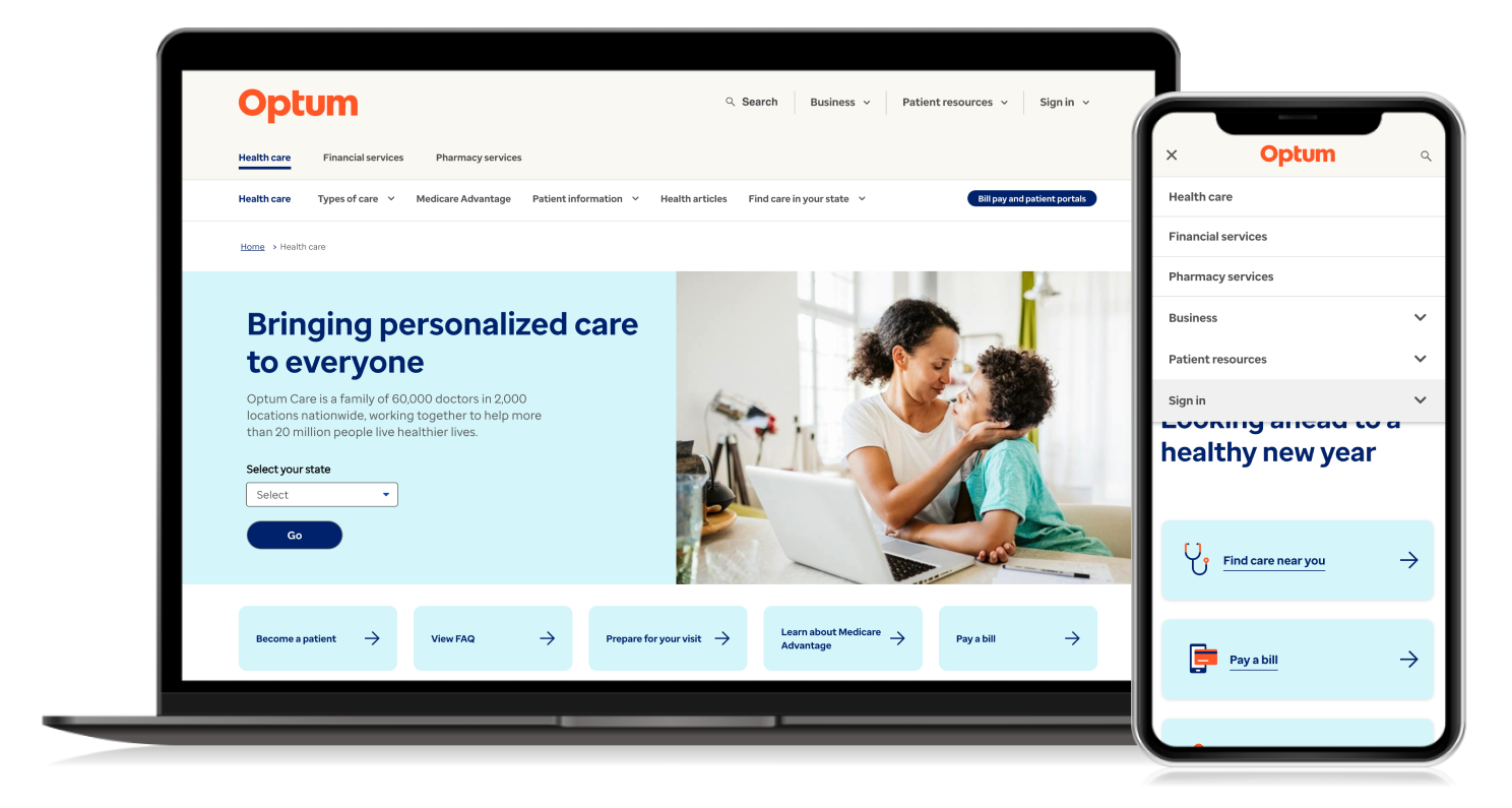
Horizon 1
Before
Navigation on Optum.com was confusing for consumers, creating friction and hurting satisfaction. Key content and services were being overlooked due to weak information scent and fragmented pathways.
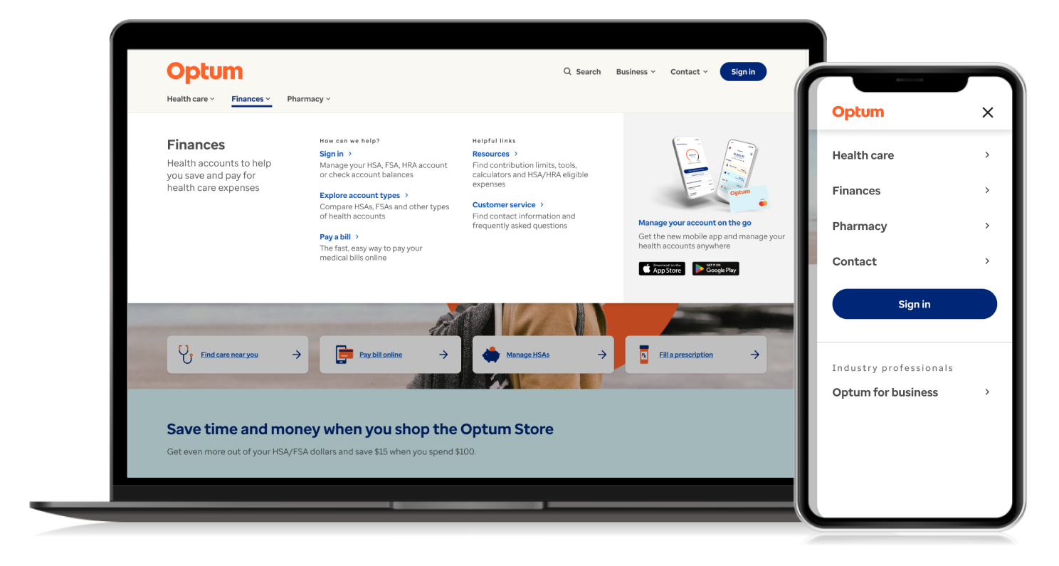
After
The menu was simplified into three clear categories: Health Care, Pharmacy, and Financial. Each menu has contextual support options, including chat, phone, and email, along with personalized article recommendations increasing discoverability.
Horizon 2
We combined behavioral analysis, prototype testing, and stakeholder workshops to deliver a navigation that meets user expectations and supports business goals as Optum.com goes through re-branding in addition to wayfinding simplification.
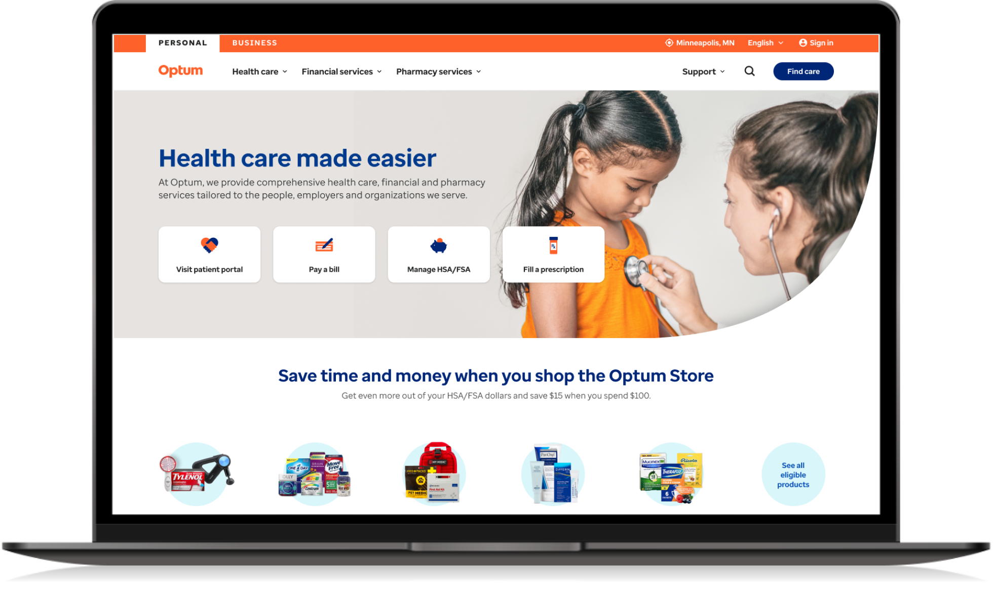
1
Decreased overall height of header to pull content higher up on the page.
2
Introduction of the Personal and Business toggle enabling members and providers distinct experiences.
3
Geolocation to better serve members based on where they are.
4
Translation services to better serve members based on their native language.
5
Sign in moved to the Global utility bar to reinforce Optum’s single sign in experience.
6
Find care becomes the primary call to action on the member site reinforcing the primary job to be done.
Move your product forward
Whether you need design leadership, systems thinking, or a clear path through complexity, I bring strategic clarity and measurable impact to every engagement.