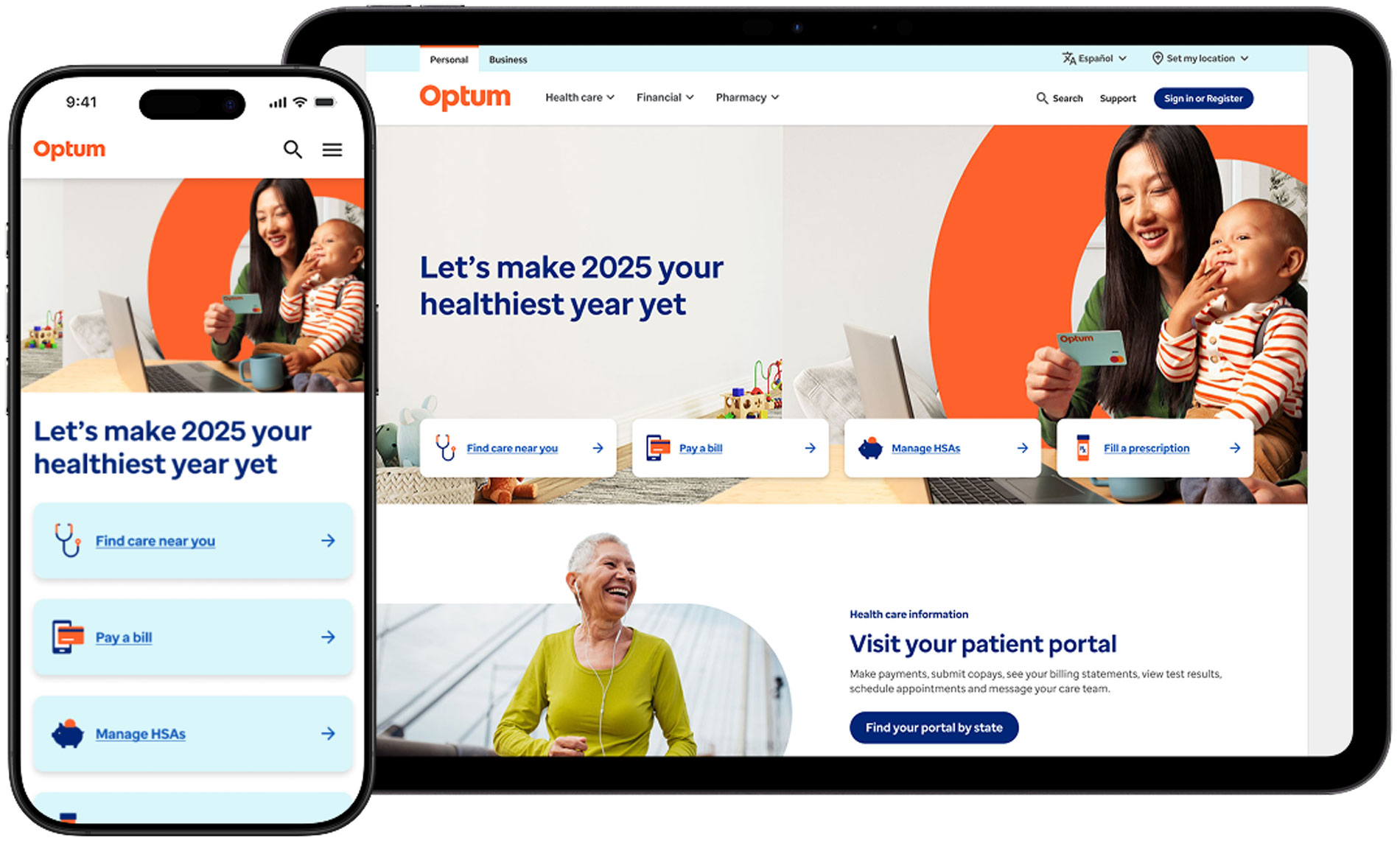
I led the Optum.com homepage redesign to simplify a complex enterprise entry point, improve discoverability, and create an executive‑grade prototype used for stakeholder alignment. The project combined rapid prototyping, content strategy, and design‑system modernization to produce a scalable homepage that improved clarity for users and confidence for leadership.
Team
- UX researchers
- Engineers
- Design leadership
Tools
- Figma prototypes
- Glassbox + MUIQ
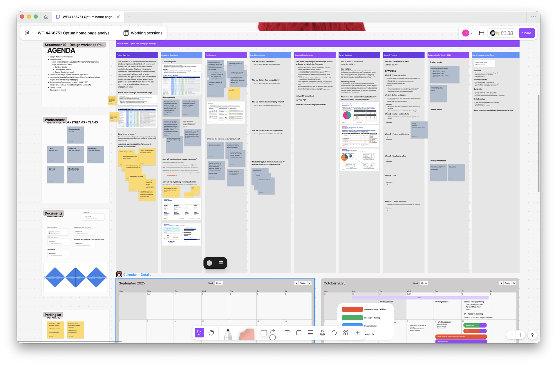
- Miro for workshops
Role
-
Lead Product Designer
-
Research synthesis
-
Content strategy
-
Rapid prototyping
-
Stakeholder alignment
-
Collaborated with marketing, product, and engineering
Timeline
1 month
Key performance highlights
13
%
Bounce rate reduction
40.22
%
Increase in engagement
24
%
Increase in task completion
The opportunity
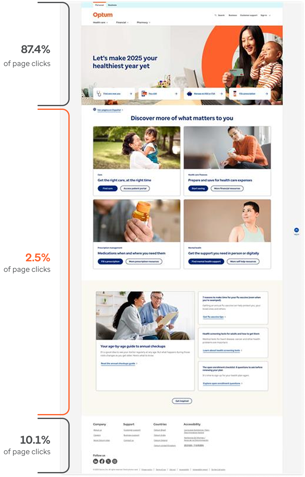
Research summary and heat map insights
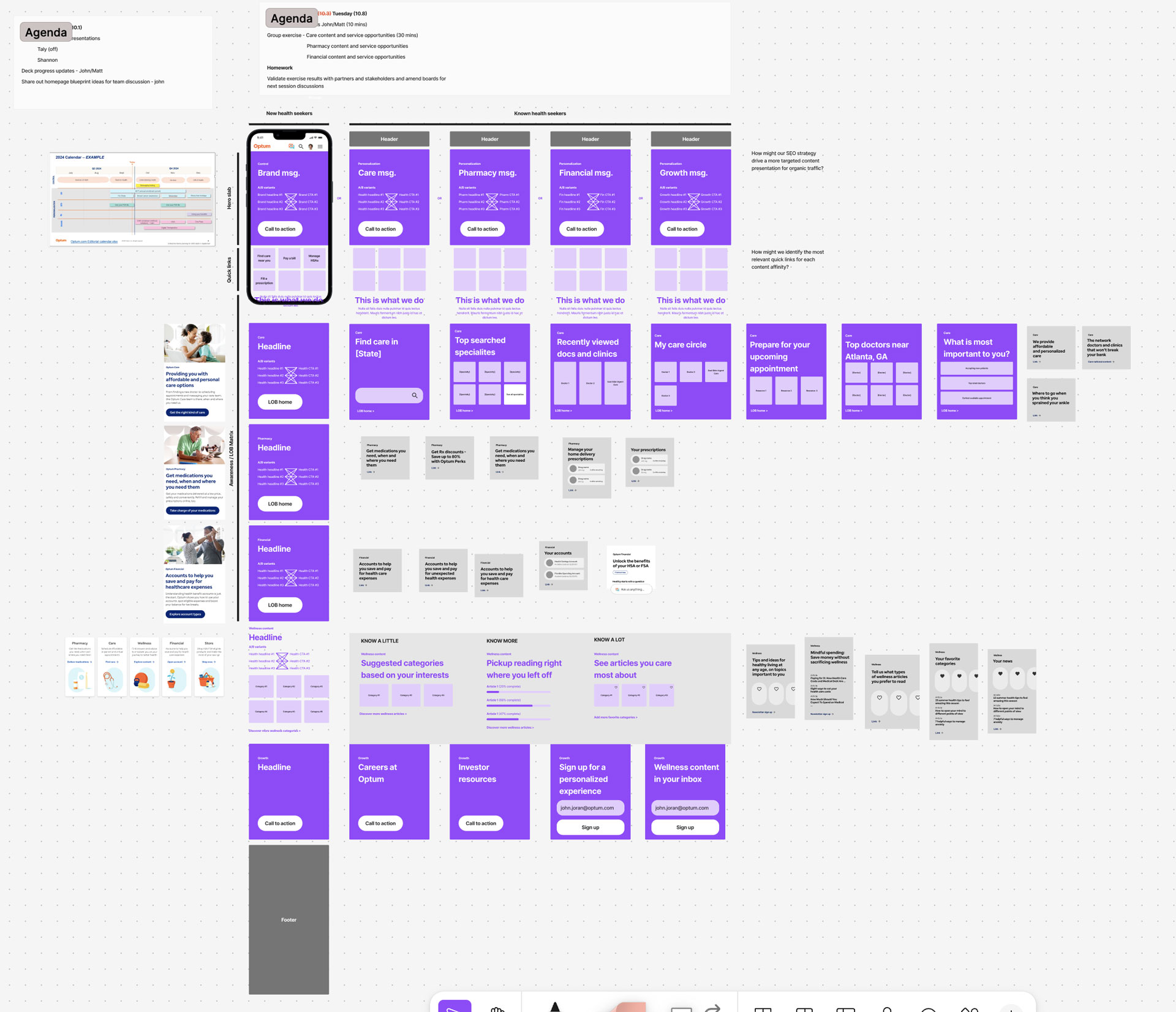
Worthwhile real estate was being overlooked. Heat maps and session recordings showed low engagement in the body of the homepage. New and known health seekers frequently engage with the optum.com header, quick links and footer on the homepage. Content between these sections was being passed over due to poor information scent or irrelevant content.
Teamwork & process
How we collaborated
Cross‑discipline collaboration turned insight into action. I led product, content, research, design, engineering, accessibility, and analytics by running workshops, prototyping, and validating with real users. Our approach prioritized quick wins that could be measured and iterated.
Design principles & interaction patterns
Prompt action
Design a homepage that encourages the member to scroll down the page while providing specific examples of Optum’s content and services
Communicate who we are
60% of homepage traffic are new health seekers to the site. Ensure consumers know what they can do; Optum has a story, don’t make people guess
Reveal through interaction
Promote efficient miro-journeys with clear CTAs that resonate with health seekers while personalizing messaging to those who show affinity to specific services
Keep it simple
Waste no pixels with mobile first layouts to provide immediate access to jobs to be done and avoid tactics that detract from a health seekers goals on the site
Brand involvement
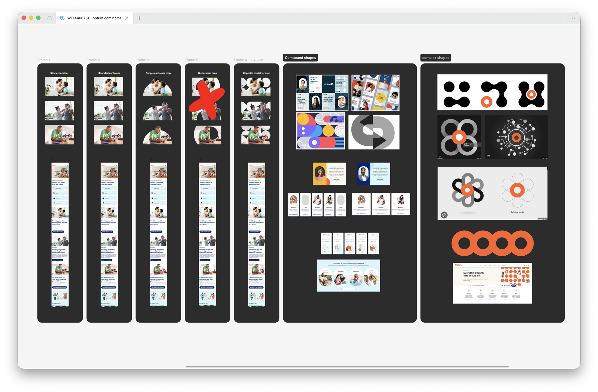
From concept to consensus: imagery explorations
These two visuals document our iterative process: initial image treatments and refined wireframe integrations reviewed with the Optum brand team. They illustrate how compound and complex shapes, lifestyle crops, and the Aura concept were tested, critiqued, and adapted to work across desktop and mobile contexts.

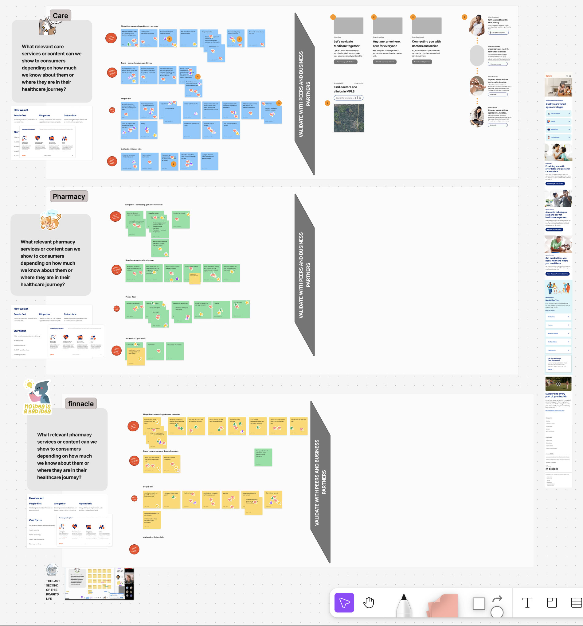
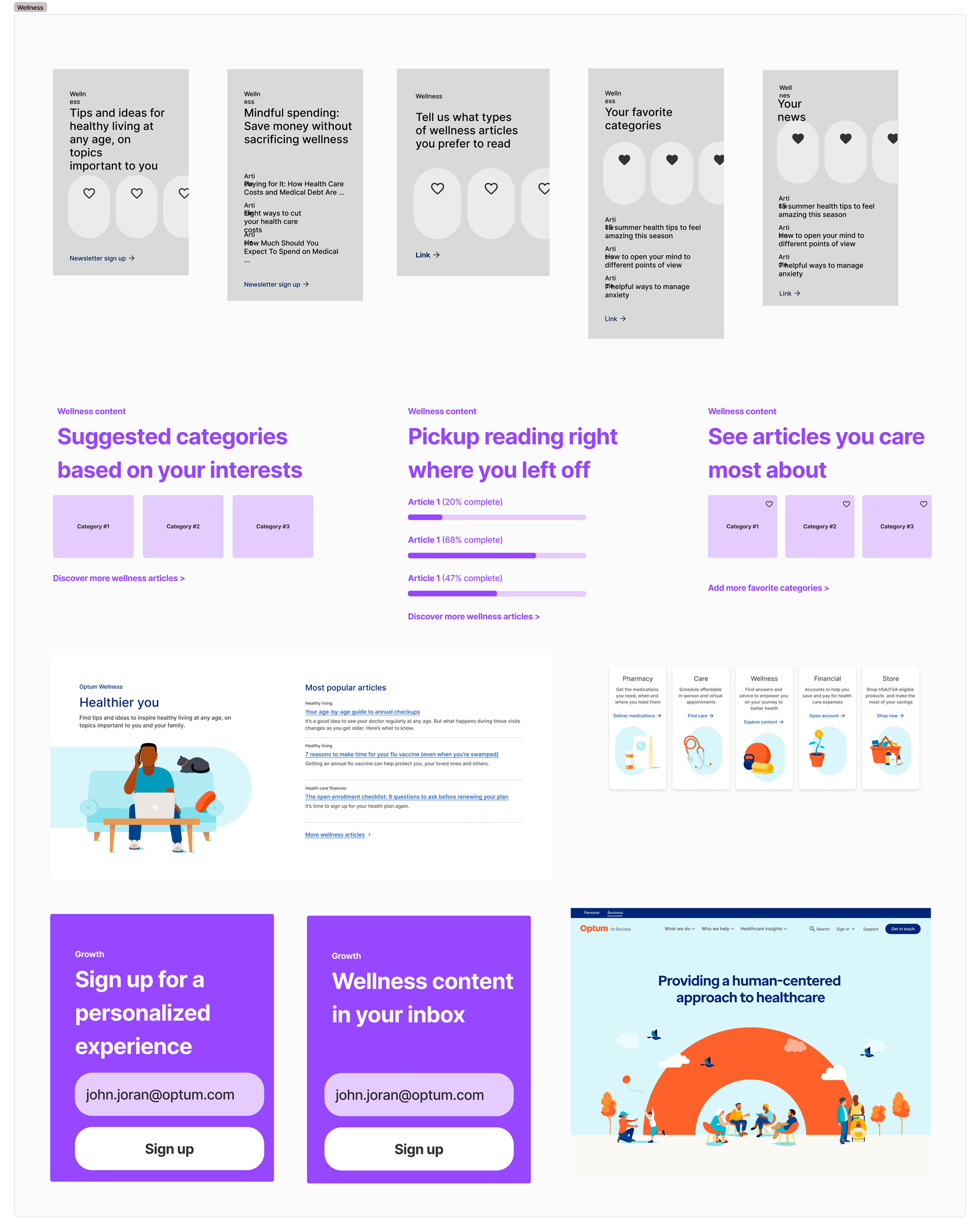
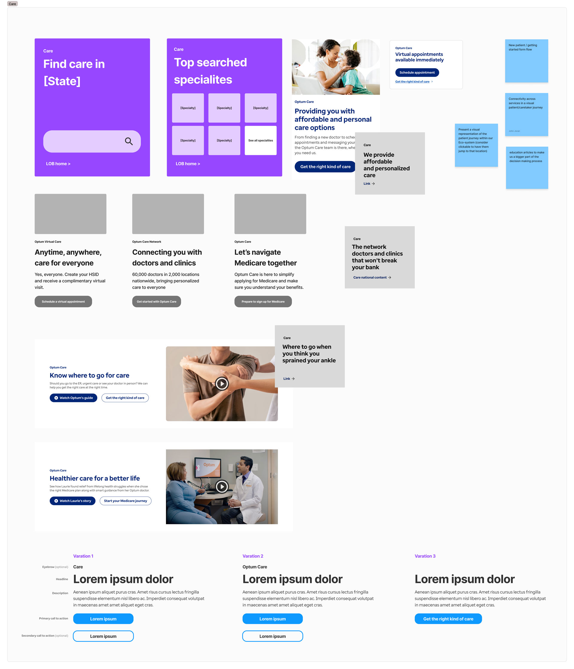
Personalization
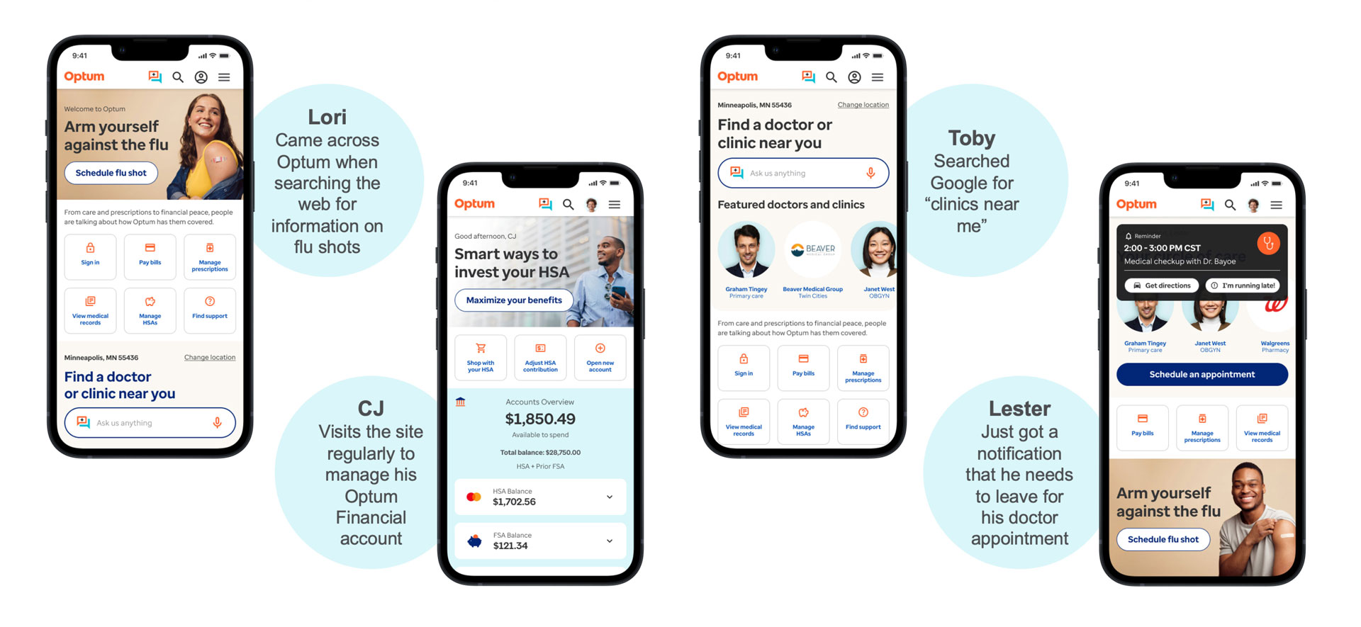
Same site, same day, different experiences
We scoped five audience modules—New, Financial, Pharmacy, Wellness, Clinical—each with tailored hero messaging, a prioritized CTA, and a short set of contextual links. The goal: reduce bounce by surfacing the right next step within three seconds.
Rollout
Perfect is the enemy of progress
We shipped a phased, platform‑agnostic solution: quick wins first (header, hero CTAs), then modular content blocks, then personalization experiments. Measurement focused on bounce rate and engagement rate as primary signals of success.

Move your product forward
Whether you need design leadership, systems thinking, or a clear path through complexity, I bring strategic clarity and measurable impact to every engagement.